Advanced Swirling Part 1: Understanding Color Theory Terminology
Guest post by Kat from Otion (Bramble Berry’s retail store)
Now that you understand the fundamentals of cold process Soapmaking, let’s get artistic! You can set your product apart from the rest with eye-catching swirls and have fun in the process.
Not familiar with cold process yet? Check out these videos on Soap Queen TV to and learn about Lye Safety, The Basics, Fragrances and Colorants.
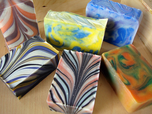
It is vital to have a solid understanding of color relationships and swirling techniques in order to swirl soap confidently. This four-step series will reveal the secrets to success and guide you through the following topics: 1) Understanding Color Theory Terminology 2) Getting Brave with Color 3) Design and Color Matching 4) Swirling Techniques Made Simple
It’s time to take those bars from boring to beautiful!
Color Wheel/ Best Friend
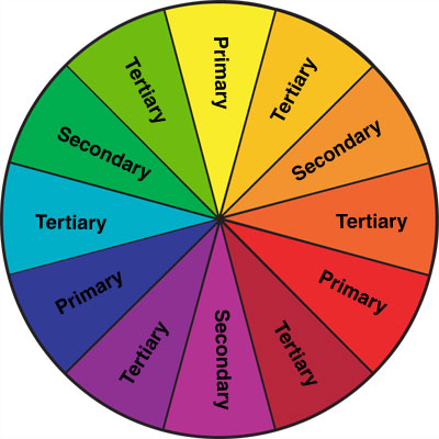
Let’s start with some important color theory terms that you will see me refer to frequently:
Contrast: This is the stand-out factor. It can mean dark versus light or bright versus muted. Contrast is the effect of juxtaposed colors and values in your swirl pattern. When I want high contrast, I am referring to opposites for the most POP! Black and white are high contrasting colors that really make the swirl pattern distinct.
Value: The gradation of a color. Red has many values, from very light pink, to very deep burgundy. Think of a grayscale showing light to dark values. I like to pick colors that are different values (or light/darkness) for the most interest and so my actual pattern will stand out. Imagine using pink and red. The swirl will hardly show unless you use different values. Very light pink and very dark red work together because there is plenty of contrast between the two!
Primary Colors: Red, yellow, and blue. When mixed they create:
- Secondary Colors: Red and yellow make orange, blue and red make violet, blue and yellow make green.
- Tertiary Colors: The colors in between: red-orange, orange-yellow, yellow-green, blue-green, blue-violet, violet-red.
Opposite/Complementary Colors: These are colors that are diagonally opposite each other on the color wheel (red and green, yellow and violet, blue and orange, etc.). These colors are far more interesting together than colors that are side by side on the color wheel. Plus, they provide the most contrast.
Warm vs. Cool Tones: Warm is the red family, cool is the blue family. Calm and clean colors are typically cool tones swirled with white soap and look great paired with clean linen, rain, ocean, or baby powder type fragrances. Warm tones are energetic colors and pair well with citrus blends and spices.
Your most important choice with swirling is what colors to use. Try to pick a light, medium, and dark color for the best contrast (yellow, violet, and black for example). Leave some soap neutral or white to make the lines stand out.
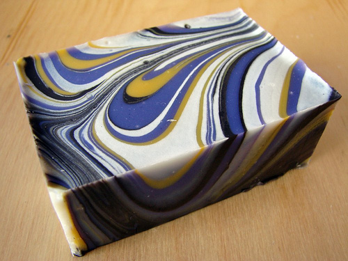
Remember, practice makes perfect! If you are a big time visual learner like me, don’t be afraid to borrow the kids’ crayon box and do a little practicing to help visualize color theory. You will learn color relationships very quickly by actually drawing your own color wheel (make a few in a row—repetition helps!), starting with the primaries. Then fill in the secondary colors based on blending (I have my primaries, so when I blend red and yellow, I get orange. When I blend blue and red I get violet, and when I blend blue and yellow I get green). Draw diagonal arrows to signify which colors are complementary. Scribble red and pink next to each other and compare it to red and green, or blue and orange. You will see the difference (contrast!). Draw a light blue next to a dark blue to see value change. Practicing like this helps you plan ahead and saves you from surprises. You will know what you’re going to get before adding color to the pot!
![corner3[1]](https://www.soapqueen.com/wp-content/uploads/2014/05/corner31-120x120.jpg)
![m&p20Color20wall1[1]](https://www.soapqueen.com/wp-content/uploads/2014/05/mp20Color20wall11-120x120.jpg)
![FO[1]](https://www.soapqueen.com/wp-content/uploads/2014/03/FO1-120x120.jpg)
I’m so glad you are all finding it helpful! “Sometimes the color you choose for your soap can really change the way you feel when using it.” — I couldn’t agree more! As soapmakers, we are dealing with a lot of sensory elements (hopefully not taste, despite how delicious those cupcake bars look), and color/design has a lot to do with the ‘mood’ of the bar. Thanks for the comments 🙂
Thank you for the reminder on how colours work. It’s funny that you mention pulling out the crayons, because that’s exactly what my husband told me to do as well!
Kat,
This is so funny, I was just down in my soap room this morning and happened to look at a book I bought at the conference about swirling. I thought about the demo that Brambleberry gave and said to my self, I sure could use a refresher, then I log on to email and here it is, great!
Nice article Kat, looking forward to the rest of the series 🙂
Sometimes the color you choose for your soap can really change the way you feel when using it. This was a great post on the importance of color!
Great post Kat!! I cannot wait for read the rest of them.
Hugs.
Claudia
Mexico
Kat, you’re an inspiration! Thank you.